Master Flex-Box CSS like a Pro❕❕

Before the Flexbox Layout module, there were four layout modes:
- Block, for sections in a webpageInline,
- for textTable,
- for two-dimensional table dataPositioned,
- for explicit position of an element
The Flexible Box Layout Module, makes it easier to design flexible responsive layout structure without using float or positioning.
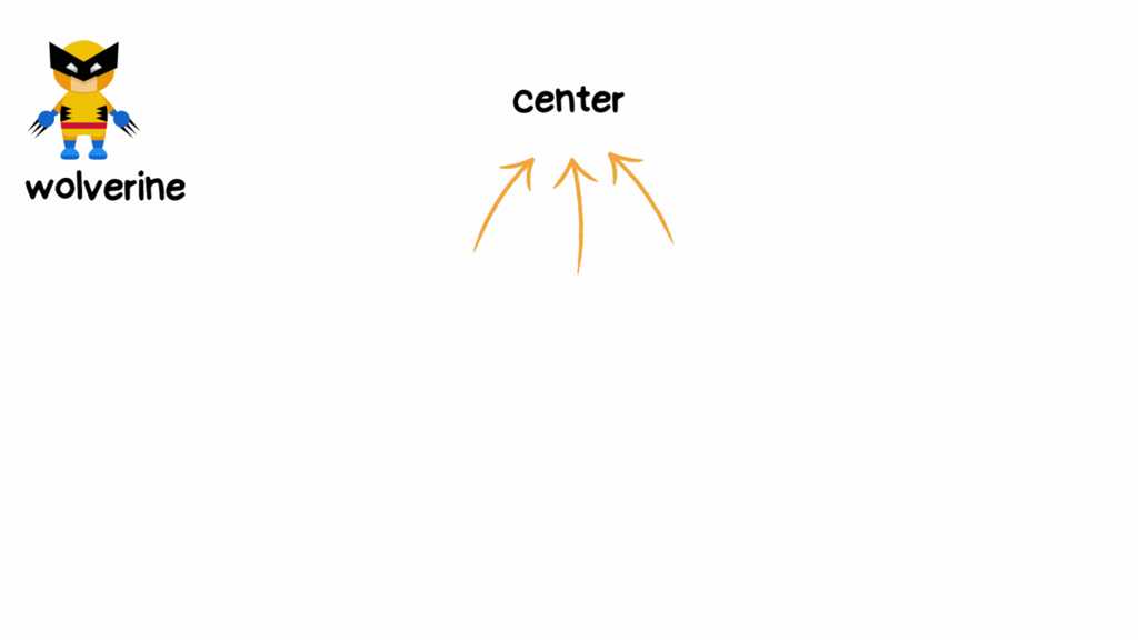
For this demonstration, I'll be using wolverine to show you how can place him right to where the arrows are that is the center

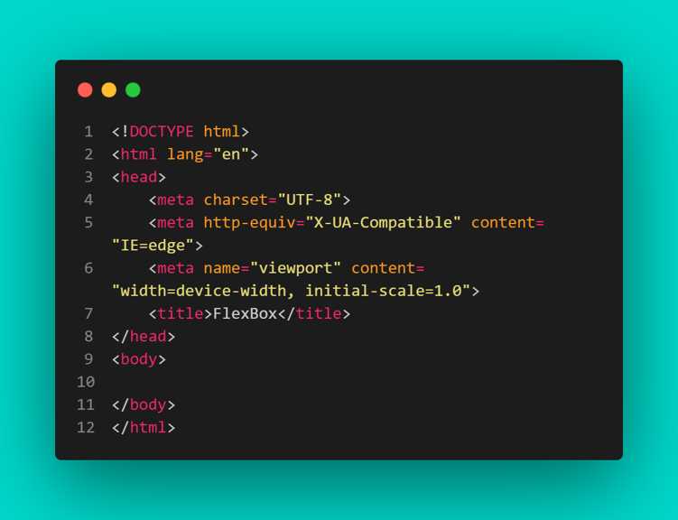
1️⃣ We start with our boiler plate,
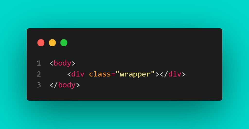
2️⃣ Create a div element with a class known as wrapper
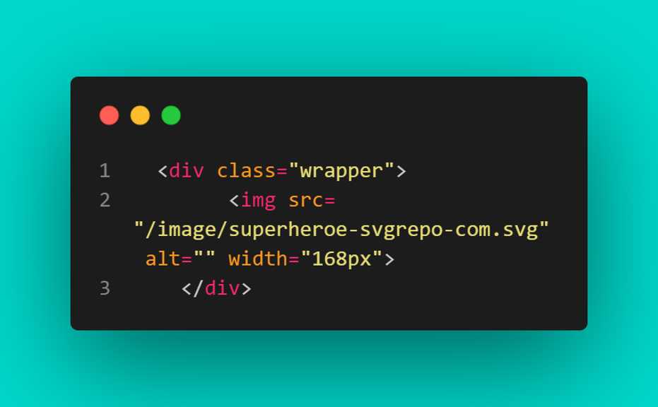
3️⃣ We place our image tag of the wolverine right inside our div element wrapper,
4️⃣ Next step,
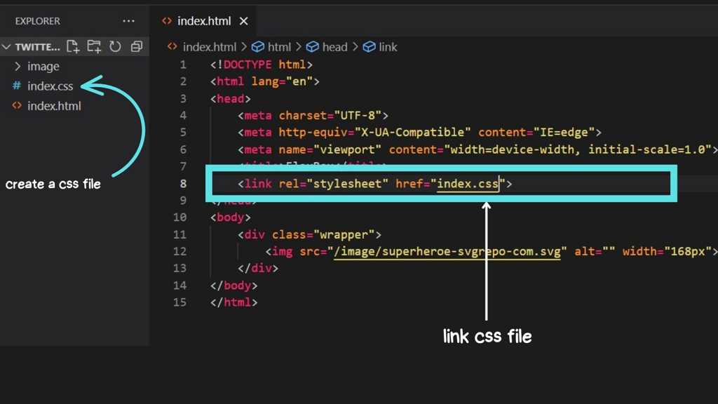
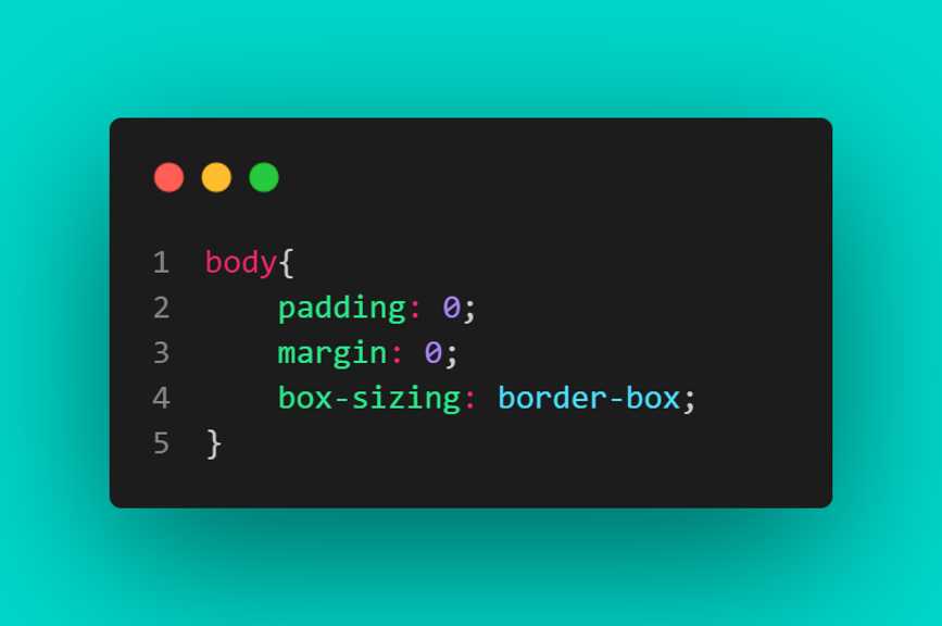
5️⃣ In the CSS file we just created, we have to ensure that the body has the following properties and values
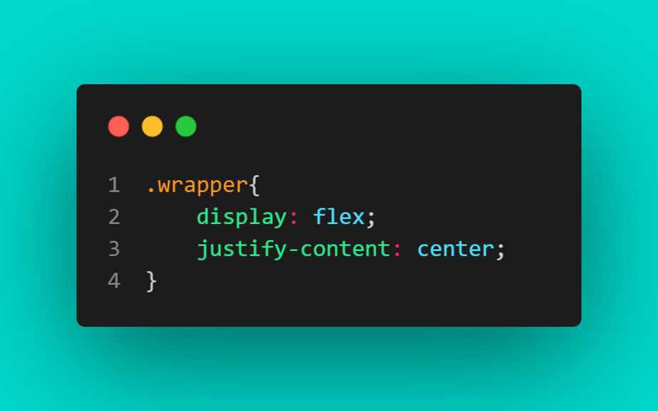
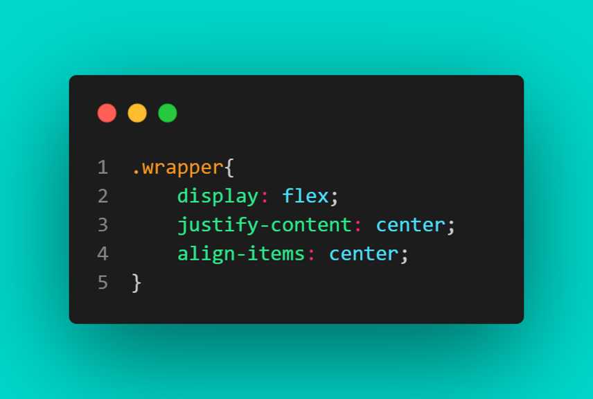
6️⃣ Then we grab our wrapper class and set the following properties and values
Results:
Now, what did we notice here❓
We noticed that the Wolverine is perfectly centered but we are not satisfied. We want the wolverine to be in the middle of our page and to do that we need one last property to set us free from our mysteries
Result:
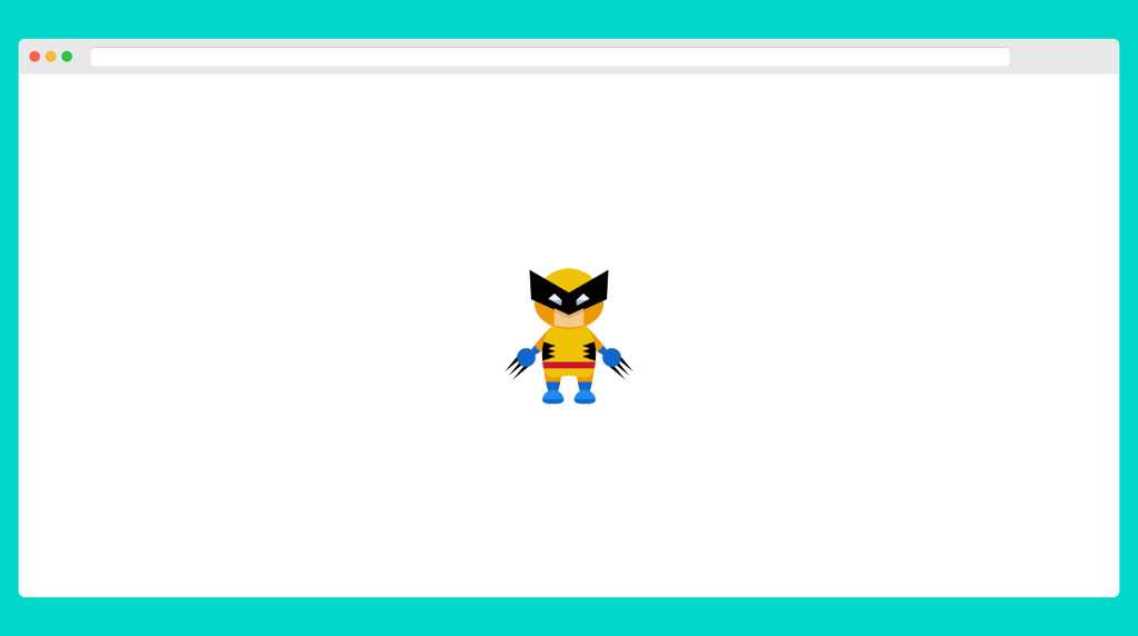
Are we satisfied❓❓
Yes we are. So we successfully centered the wolverine to center of our page and mind you this little project we just did, can be applied in real life projects.
That the fun part of it.
With all these said, that brings me to the end of this part of this flex-box adventure. See you in the next Part
Follow me @just_Arizon on twitter